
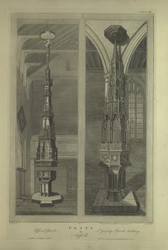
Plate 3.25: Fonts at Ufford and Sudbury
Object: The Ufford and Sudbury fonts and covers are still in existence and in relatively good shape due to periodic conservation efforts over the centuries. Some details have disappeared, but, on the whole, they are quite similar to the engravings published in Vestuta Monumenta. Composed of oak and slotted together using mortise and tenon, these micro-architectural edifices rise up multiple stages to twenty feet for Ufford and twelve feet for Sudbury. Their cascading cusped and traceried ogee arches, flying buttresses, and pinnacles are adorned with pigment, much of it original at Ufford, while Sudbury was repainted later. Seventeenth-century iconoclasts destroyed the sculptures and paintings associated that adorned the cover, but a magnificent pelican in her piety remains atop that at Ufford. The very heavy covers are lifted from their fonts using counterweight systems which rely on a central iron rod placed through the middle of their structure. The Ufford cover atop an earlier fifteenth-century font telescopes up, one portion covering the next. The later fourteenth-century font at Sudbury originally was accessed by cupboard-like doors, while the cover was stationary, but in the nineteenth century, it was transformed into a single piece that is lifted entirely off the font. Such a spectacle increased the visual and emotional impact when, for a brief moment, the infant was the center of a sacramental event. The massive physical presence of the covers matched that of the rood and rood screen, connecting the sacraments of baptism and the Eucharist together for parishioners.
Transcription:
Top Left: J. Johnson del.
Top Center: Basire Sc.
Top Center Right: Scale...Feet
Top Right: J. Carter del.
Center Left: Ufford Church
Center: Fonts in Suffolk
Center Right: St. Gregory's Church, Sudbury
Bottom Left: Sumptibus Soc Antiquar Londini.
Bottom Right: Published according to act of Parliament, 23.d April 1792.
.
Translation:
Published by the Society of Antiquaries, London.
Original Explanatory Account: Click here to read the original explanatory account for Plate 3.25.
Commentary by Sarah Blick: When the editors of Vetusta Monumenta hired James Basire, Sr. to engrave baptismal fonts and font covers at Ufford, Church of the Assumption and Sudbury, St. Gregory in Suffolk, they saved a history that would have been long swept away by crumbling structures, rotting, and lost memories. Fonts themselves, as crucial for the sacrament of baptism, had long been studied and both fonts are accurately reproduced here with their geometric cusped designs characteristic of late fourteenth-fifteenth centuries. These engravings, however, were inspired by the richly ornamented font covers, which fill the majority of the space in Basire’s vertical composition. As noted in the accompanying letterpress account, these fonts “are remarkable for their covers” (Gough 1792b, 1). Such covers graced the tops of almost every baptismal font in medieval England as they required locked covers to holy water away from potentially problematic magical uses, following Edmund Rich’s 1236 edict (Wilkins, 1.636, 656f.). For parishes, locking was less consequential than the magnificent covers that inspired prayers and conveyed prestige. It would not be until the late fifteenth / early sixteenth centuries that they became large-scale architectural structures created to enhance the worship experience of the laity at baptism and in regular church attendance.
Baptism was a magical, protective, inclusive event, composed of rites that separated the child, prepared it, and then incorporated it into the community. Family and friends, carrying the infant, would process to the church with lit candles and special cloths, and were met by the priest, who used a stylus to make the sign of the cross in sacred oils on the baby’s forehead, breast, and between its shoulders. After the godparents stated the name of the child, salt was placed in its mouth, starting a short exorcism, where the priest called upon impure spirits to flee in Christ’s name. The child was then un-swaddled and sprinkled with water three times. Purified, the infant was brought into the church to the font where it would be sprinkled with consecrated water. Held by a godparent, the baby was anointed with a chrism cloth, named again, and then redressed in white. The priest, after placing a small candle in its tiny hand, concluded the ceremony by chanting Gospel passages as the bells were rung. For the healthy infant, it was a mildly upsetting event, but for the family, a joyous one, as they gathered around the font. Through the ritual, the child was accepted into the parish and given their “Christian” name. Afterwards there was often a christening feast/celebration at the house of the parents with food and drink and lots of noise that protected the child.
In contrast to other large-scale installations within churches as depicted in Vetusta Monumenta, the prodigious size of these font covers necessitated showing them within a full architectural setting. Both are centered within the two halves of the print, stretching vertically, their height emphasized by the Ufford bell loft (on the left) and Sudbury’s tall window (on the right). These micro-architectural edifices, rising in multiple stages with cascading cusped and traceried ogee arches, were typically created using a small number of patterns repeated throughout, and were once brightly painted and adorned with imagery of baptism. While the font was necessary, the cover added drama. Access to the font worked through counterweight systems lifting the entire (heavy) oak piece up and away, or telescoping upwards, one portion covering the next, or opening with cupboard-like doors. The spectacle increased the visual and emotional impact when, briefly, the infant was the center of a sacramental event.
As important as that was, the often-complex imagery on the font and cover would be interacted with by parishioners who regularly walked by or stood near the font, which allowed them to process its symbolic nature. The location and height of the font and cover competed and cooperated visually with the rood screen. Fonts placed inside the south church door created a direct line opposite the altar in the chancel. This placement visually and spatially linked the sacrament of Baptism to that of the Eucharist. As Thomas Aquinas noted, “Through baptism one is incorporated into the passion and death of Christ . . . Every baptized person is communicated as though the person had suffered and died. For the passion of Christ . . . is a sufficient satisfaction for all the sins of all people” (Aquinas 2006, 128/Summa theologiae 3, q. 73, a. 3).
By the time of the 1791 publication of these two surviving font covers, most others had been lost, destroyed in waves of Reformation and Puritan iconoclasm, changing religious rituals, and the everyday tragedies of fire, flood, and general decay. Both covers remain, but their entry in Vetusta Monumenta reveals the long, eventful afterlife of these works, their presence showing how parishioners cared for these pieces that reflected local pride.
The depiction of the font covers was influenced by Richard Gough (1735-1809), Director of the Society of Antiquaries of London (SAL), who wrote the letterpress account that accompanied this print, drawn from his own longer article on the subject (Gough (1792a). In the longer paper, first read at the SAL in 1789 and subsequently published in Archaeologia, he observes that “instances of costly and labored covers, finished in a rich Gothic style of woodwork, may be found at Luton in Bedfordshire, Ufford, Worlingworth, and St. Gregory’s in Suffolk . . . reaching the top of the church, and suspended by a pulley” (Gough 1792b, 206). According to Gough in this article, “that at Ufford is superior, being elaborately executed and diminishing pyramidically to the very roof.” The Society’s influence continued through restoration as well as through the fame encouraged by the print. One nineteenth-century source records that “[Ufford] cover ... [was] repaired some years ago, at the expense of the Antiquarian Society” (White 1844, 271), while another points out that “the church contains a font with a curious cover, which has been engraved by the Society of Antiquaries” (Lewis 1848, 4.413).
Sudbury’s twelve-foot, richly painted and gilded cover, drawn by John Carter, is composed of a lower octagon rendered with eight nodding ogee niches. Above this, three tiers of tracery are topped by a spire ending in an octagonal tester with cusped tracery. As detailed as this is, certain features are omitted: the rope and pulley working the counterweight system and the “dark blue curtain” (Neale 1825, 341-42) which hung from the tester covering the entire monument. The cupboard-like opening (now nailed shut and opened telescopically) is also missing. Without these details, the edifice seems like it could never move from the font it covers. Carter’s image also renders the octagonal, late fourteenth-century Sudbury font with its shallow bowl, adorned with cusped geometric, traceried forms, supported by eight columns. It also depicts an earlier square base, that was replaced later by an octagonal form.
In contrast, the engraving of the twenty-foot cover at Ufford, drawn by J. Johnson (likely John Lees Johnson) (Munby 2014), records elements that are now missing: more floral panels and an iron ring supporting a wooden tester placed above the finial of the pelican in piety and from which a long curtain enclosed the piece. The use of curtains on font covers meshes with widespread liturgical and para-liturgical practice. Curtains -- raised, lowered, or pushed aside to conceal or reveal images (especially during Lent) -- were found in all churches. Inventories list winches, ribbons, and suspension iron rings for lenten cloths and to cover images. Given the larger size of this cover, there is less room here for detailed depiction of the early fifteenth-century font, though one can see the alternating Tudor roses and shields on the bowl, which is supported by heads at each corner framed by roses and foliage., as well as the design incorporating the Suffolk arms that are mentioned by Gough in his account.
Ufford’s cover drew more and earlier attention than Sudbury. John Weever described it as “without compare, being of great height, cut and gloriously depicted with many imageries consistent to the representation of the holy sacrament of baptisme” (Weever 1631, 753). Even William Dowsing, recording the destruction he wrought at Ufford in 1644, wrote, “There is a [vain] glorious cover over the font, like a pope’s triple crown, with a pelican on the top, picking its breast, all gilt over with gold” (Cooper 2001, 305). Its survival in generally good condition stems from the supposed misplacement of the key by churchwardens, delaying Dowsing’s ability to destroy as many images as planned, as well as from the repeated restorations it has undergone from the eighteenth through the twentieth centuries, the latest being 1988.
Antiquaries consistently celebrated the font cover at Ufford: “The cover of the font is a remarkably fine piece of Gothick carving in wood, which ascends to the roof of the church” (Whatley 1751, not paginated). Fonts themselves are mentioned and sometimes described, but most eighteenth-century antiquarians remained silent regarding most font covers, presumably because they did not arouse much interest (Luckombe 1790, 3.np). There is, however, an unusually rich record of antiquarians drawing and owning renditions of the Ufford cover. For instance, artist Isaac Johnson of Woodbridge (1754-1835) drew the cover c. 1770-1790, while collector George Nassar (1756-1823) owned a watercolor of the font and cover which sold in 1824 (Cooper 2001, fig. 53; Nassar 1824, 13 [Lot 216]). Images by a pioneer of chromolithographs, James Colling (Colling 1838, 2.plates 51-60) would increase the cover’s fame, spurring further praise from nineteenth-century antiquarians. “The font cover in the Ch. has been one of the most beautiful in the kingdom,” observed Walford (1818, not paginated) and a writer for the Benares Magazine declared that “Ufford boasts of the most magnificent font cover perhaps in the world” (“On the different styles” 1849, 171).
These two are the only medieval font covers engraved for Vetusta Monumenta, but other fonts are depicted on Plate 1.3 and Plates 2.39-40. Discussions and depictions of numerous other fonts, and a few font covers, are recorded in the minutes of the SAL. Gough’s letterpress account touches on other examples at Ashdon, Luton, and Kenninghall, along with several “modern” (seventeenth-century) examples. Gough also mentions the extant engraving of the Worlingworth font cover by George Vertue (1753), but describes it as “inferior to those here exhibited” (Gough 1792a, 2). Many of the fonts discussed or exhibited at meetings of the SAL in the late eighteenth century were early medieval fonts with no surviving covers (Lyttelton 1773, Pegge 1792). The twelfth-century Winchester font was discussed by Gough in 1786 (SAL Council Minutes III.34) and engraved for Vetusta Monumenta (Plates 2.39-40); the Winchester drawings, like that of Sudbury engraved here, were commissioned by Gough from John Carter. The other font cover depicted in the series, at St. James’s, Piccadilly (Plate 1.3), dates to the seventeenth century. Fonts and their covers were of interest to eighteenth-century antiquaries as records of “ornament and stylistic evolution” (Sweet 2004, 272) and as items of material culture documenting past religious practice.
Plate 3.25 helped preserve two font covers by proclaiming their importance, leading to continued restoration and repair over the years, which saved them until the present day. Later antiquarians referred to these images and built on the initial writings found here. By the nineteenth century, so many churches and their decorations were falling into disrepair. With the Ecclesiological Society in the lead, necessary (and some unnecessary) repairs were undertaken. Nonetheless, while many font covers were replaced or disposed of in favor of “correct” medieval (Victorian) versions, both of those featured here survived.
Works Cited:
Aquinas, Thomas. 2006. Summa theologiae, translated by Richard Viladesau. The Beauty of the Cross: The Passion of Christ in Theology and the Arts from the Catacombs to the Eve of the Renaissance. Oxford: Oxford University Press.
Colling, James Kellaway. 1838. Gothic ornaments, being a series of examples of enriched details and accessories of the architecture of Great Britain. Drawn from existing authorities by James K. Colling. 2 vols. London: Published for the proprietors by G. Bell.
Cooper, Trevor, ed. 2001. The Journal of William Dowsing: Iconoclasm in East Anglia during the English Civil War. Woodbridge, Suffolk: Boydell Press for The Ecclesiological Society.
Drawing, in India ink, of the carved font in Ufford Church drawn by Isaac Johnson of Woodbridge 9 inches x 8 inches, BL Add. 8987. art. 38.
Gough, Richard. 1792a. Volume III. Plate XXV. In Vetusta Monumenta, vol. 3.
------. 1792b. “Description of the Old Font in the Church of East Meon, Hampshire 1789, with Some Observations on Fonts.” Archaeologia 10: 183-207.
Lewis, Samuel. 1831. A Topographical Dictionary of England. 4 vols. London: S. Lewis.
Luckombe, Philip. 1790. England's Gazetteer; or, an Accurate Description of All the Cities, Towns, and Villages, in the Kingdom. and Their Distances from London. 3 vols. London: G.G.J. and J. Robinson, and R. Baldwin.
Lyttelton, Charles. 1773 . “Description of an Ancient Font at Bridekirk in Cumberland”. Archaeologia 2: 131-133
Munby, Julian. September 2014. “‘Out of his element’: Mr Johnson, Sir Joseph Banks and Tattershall Castle.” The Antiquaries Journal no. 94 (September 2014): 253-89 .
Nassar, George Richard. c. 1820. Catalogue of the Valuable Collection of the Late George Nassau, Esq., Pictures, Water-Coulour Drawings, Engraved British Portraits, Prints, &c. Catalogue March 25, 1824. London, 1824.
“On the different styles of Ancient English Architecture.” 1849. The Benares Magazine 2: 166-174
Pegge, Samuel. 1792 . “Observations on an Ancient Font at Burnham Deepdale, in Norfolk”. Archaeologia 10: 177-82.
Suffolk Record Office, Ipswich Branch, Record FC-36: FC 36/E2/5; Correspondence re Church font cover, including plans of Church bells 1925-1937 (file).
Sweet, Rosemary. 2004. Antiquaries: The Discovery of the Past in Eighteenth-Century Britain. London: Hambledon and London.
Walford, Thomas. 1818. The Scientific Tourist through England, Wales, and Scotland. 2 vols. London: J. Booth.
Weever, John. 1631. Ancient funerall monuments within the vnited monarchie of Great Britaine, Ireland, and the islands adiacent. London: Thomas Harper .
Whatley, Stephen. 1751. England’s Gazetteer or, an accurate description of all the cities, towns, and villages of the kingdom. Vol. 3. London. Printed for J. and P. Knapton.
White, William. 1844. History, Gazetteer, and Directory of Suffolk; Comprising, Under a Lucid Arrangement of Subjects, A General Survey of the County. Sheffield: Robert Leader.
Wilkins, David. 1737. Concilia Magnae Britanniae et Hiberniae, a Syndo Verolamiensi, A.D. CCCCXLVI. Londinensem A.D. M DCCXVII. Accedunt Constitutiones et alia ad historiam Ecclesiae Anglicanae spectantia. 4 vols. Londion: R. Gosling.
Wilson, Stephen. 2000. The Magical Universe: Everyday Ritual and Magic in Pre-Modern Europe. London: Hambledon and London.